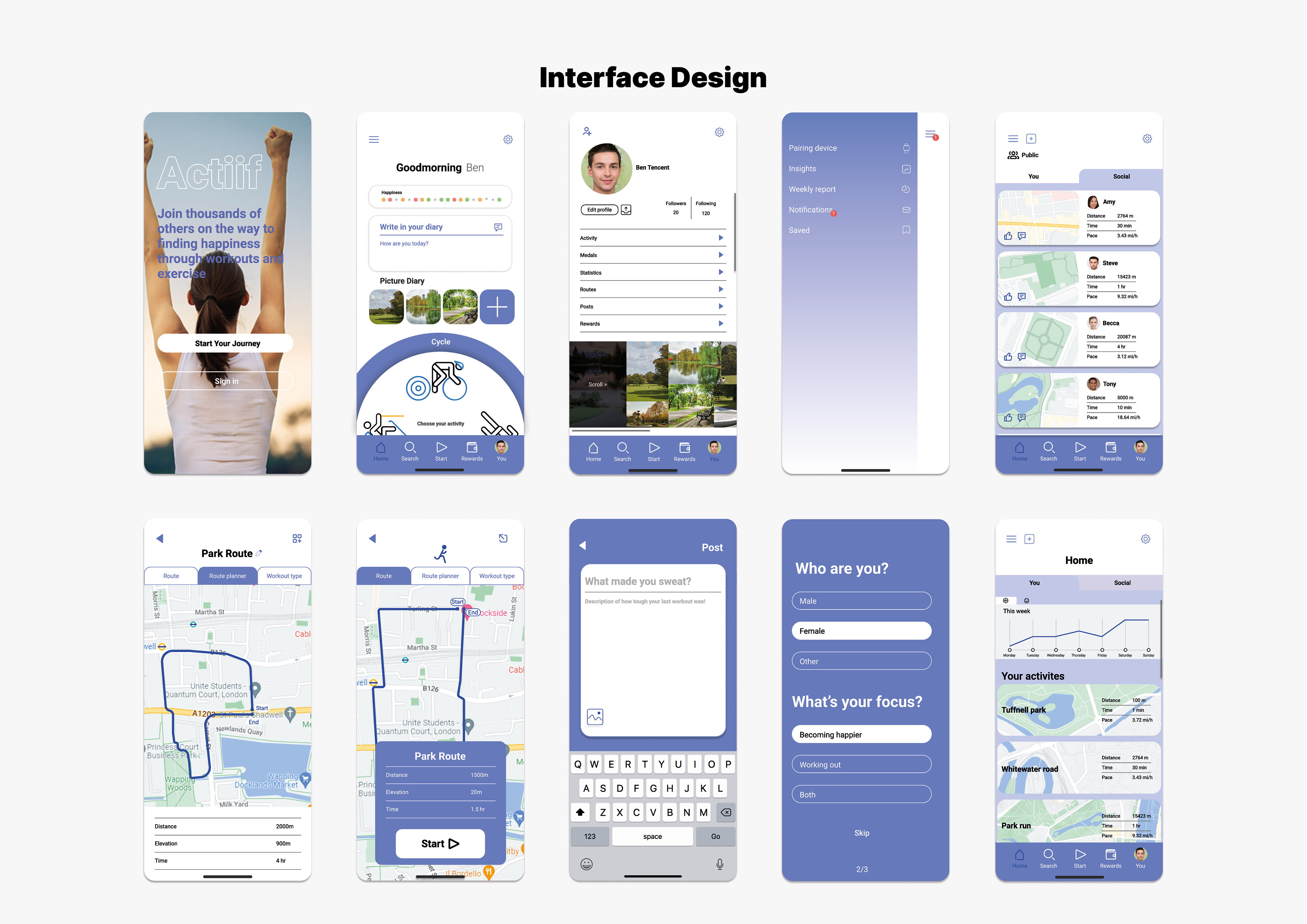
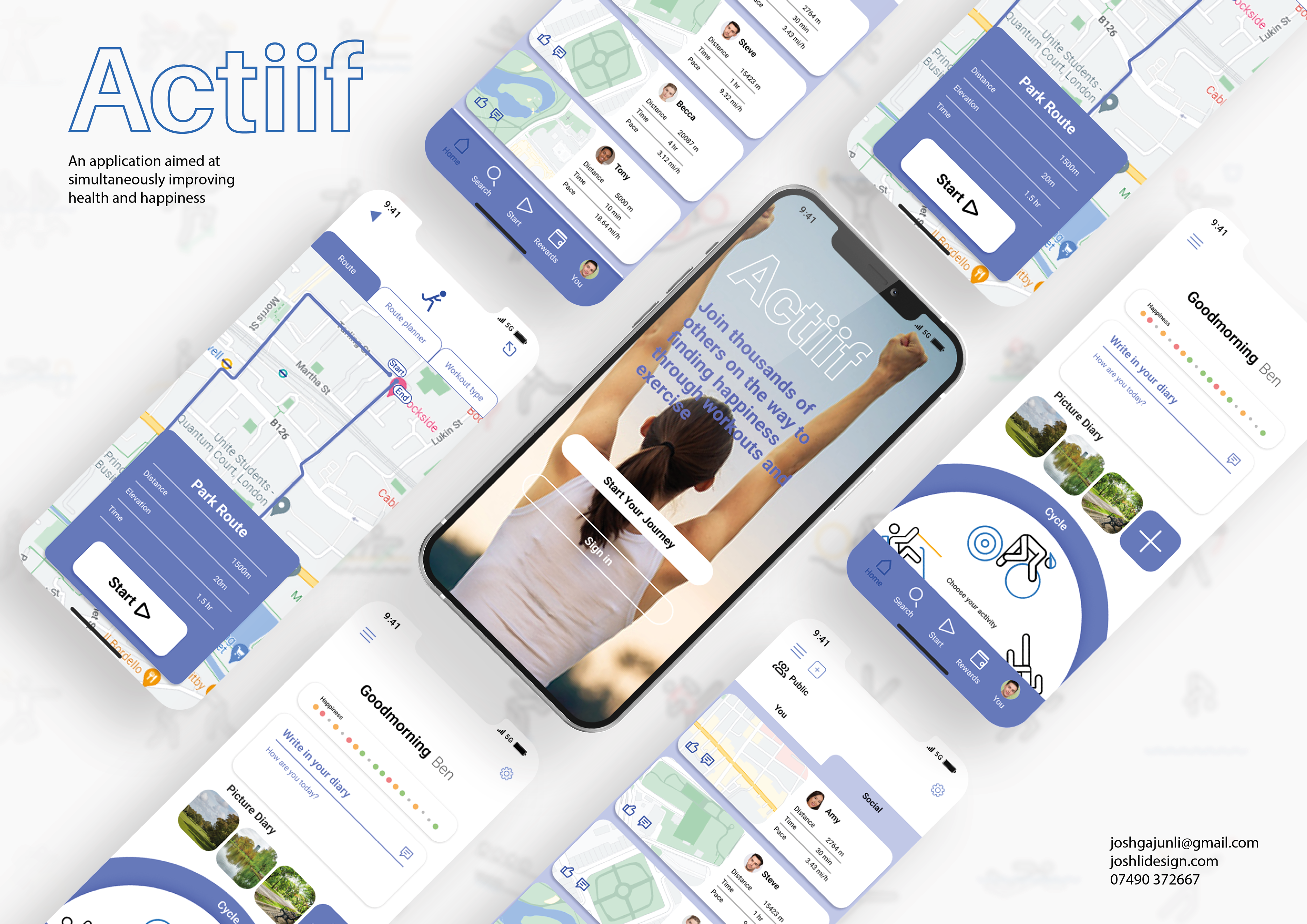
This prototype has been created based on primary and secondary user research. It was created in Figma and showcases several of the app features
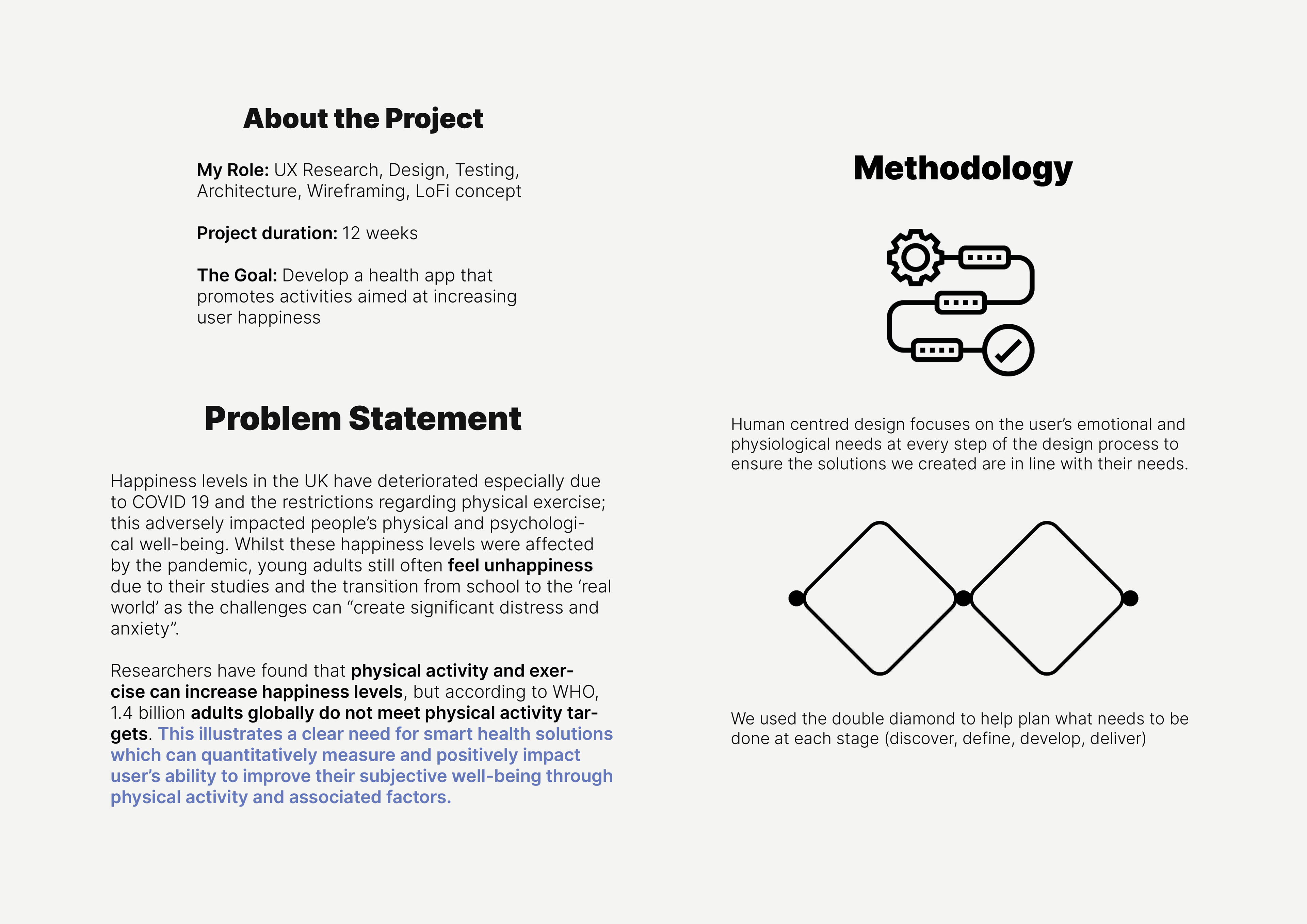
A general problem statement was made based on secondary research, identifying a problem which this app would aim to solve. Design methodologies were chosen based on how they suited the outcome, a HCD approach focused on users physiological needs.
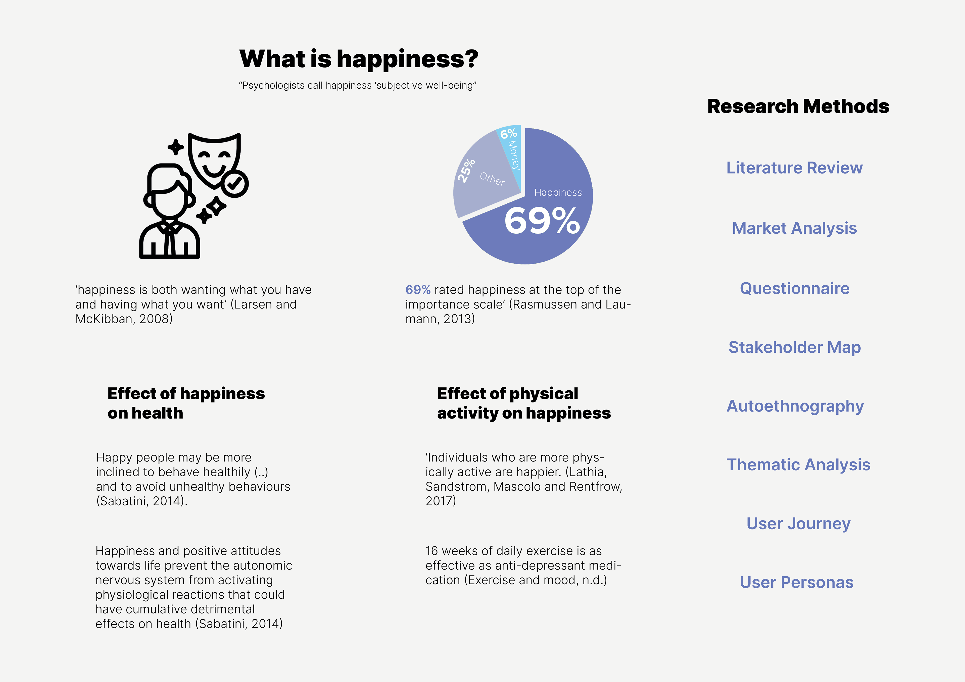
Various research methods such as Thematic Analysis, Literature reviews and primary research with potential users were used to help empathise with potential users. it was found that physical activity can affect well-being, and vice-versa.
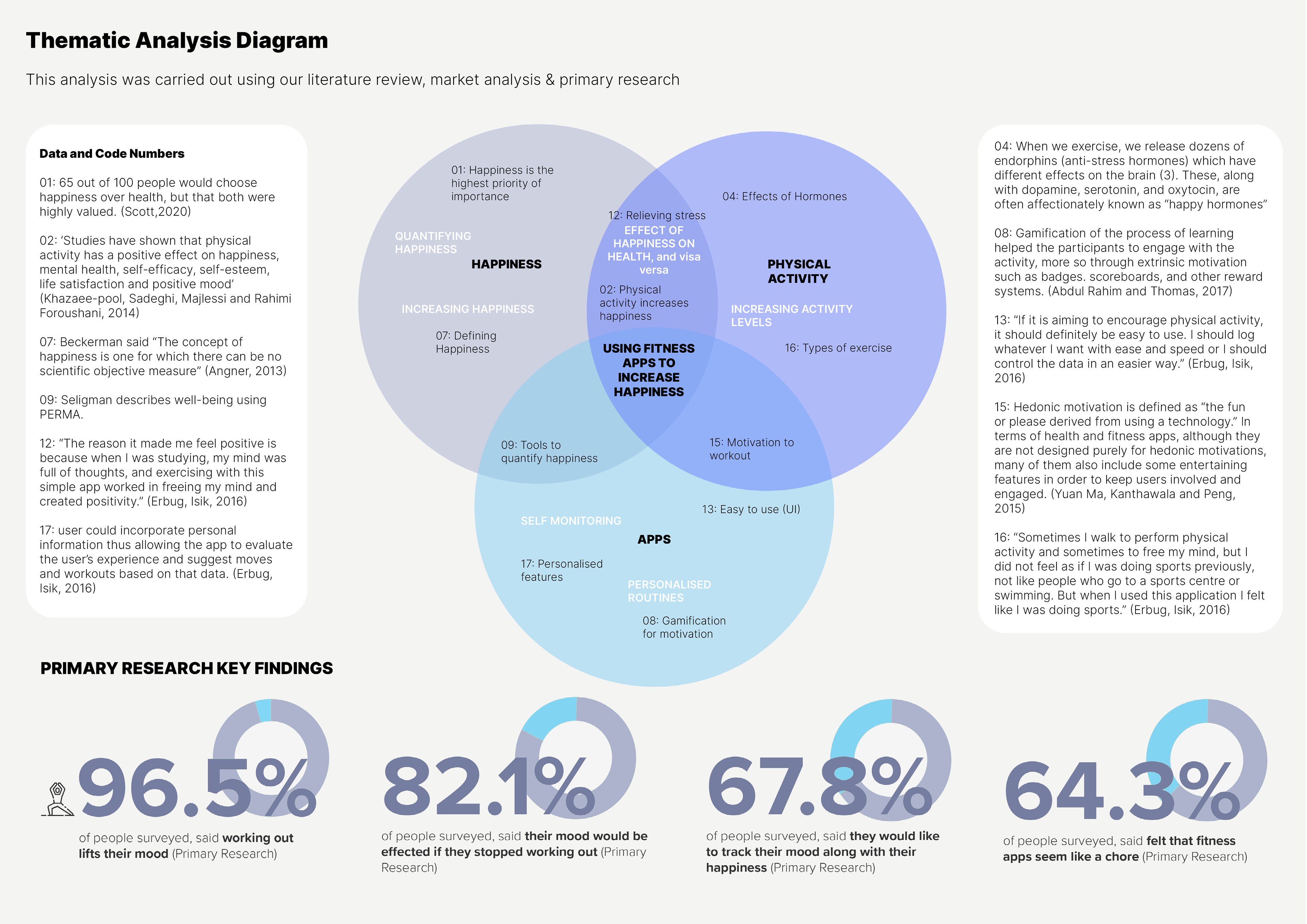
In the thematic analysis, secondary research findings were grouped into categories labelled happiness, physical activity and apps. These themes helped to inform later design decisions as they can influence which features may be implemented, and how the information architecture would look.
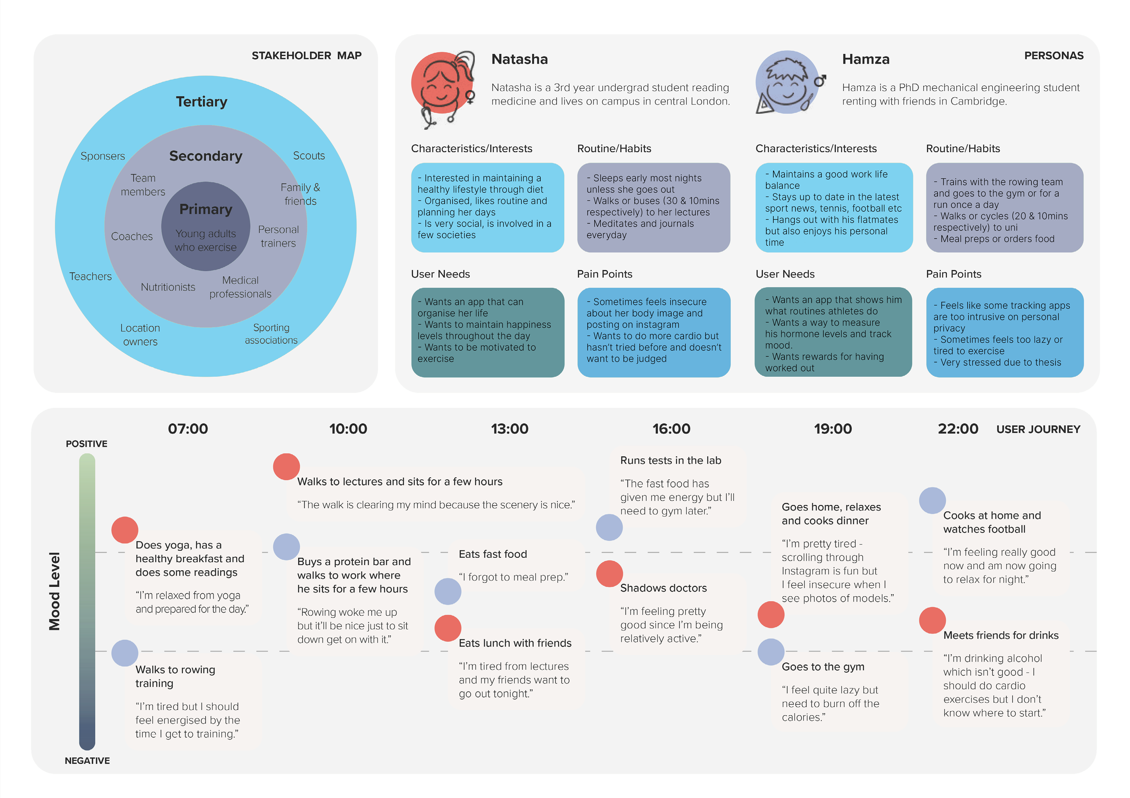
A map was created which considers primary, secondary and tertiary users. These are people who may directly interact with the service, or businesses who may indirectly interact such as Google maps. User personas were created based on primary research which highlights key findings such as user needs, pain points, routine/habits and their interests. A user journey was used to track potential user's emotions throughout the day. We found that people were more happy when they were taking part in physical activity, and less when they weren't.
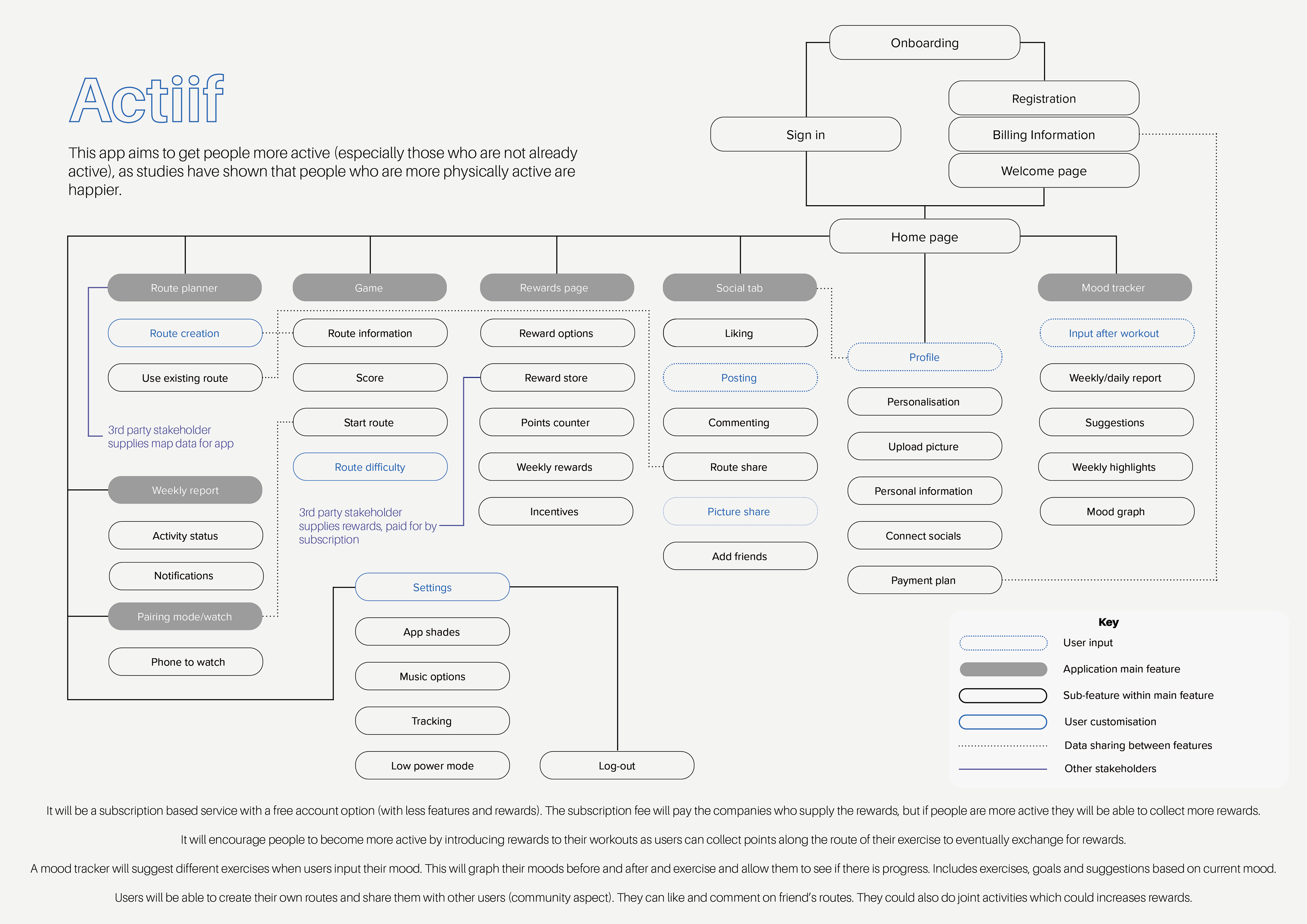
Information architecture was created to lay out the main features of the app. These features were decided based on primary and secondary user research. Several iterations were passed through potential users who added their feedback on proposed features. Conditions like user input, data sharing and app sub-features have been highlighted to show where these would fall inside the architecture.
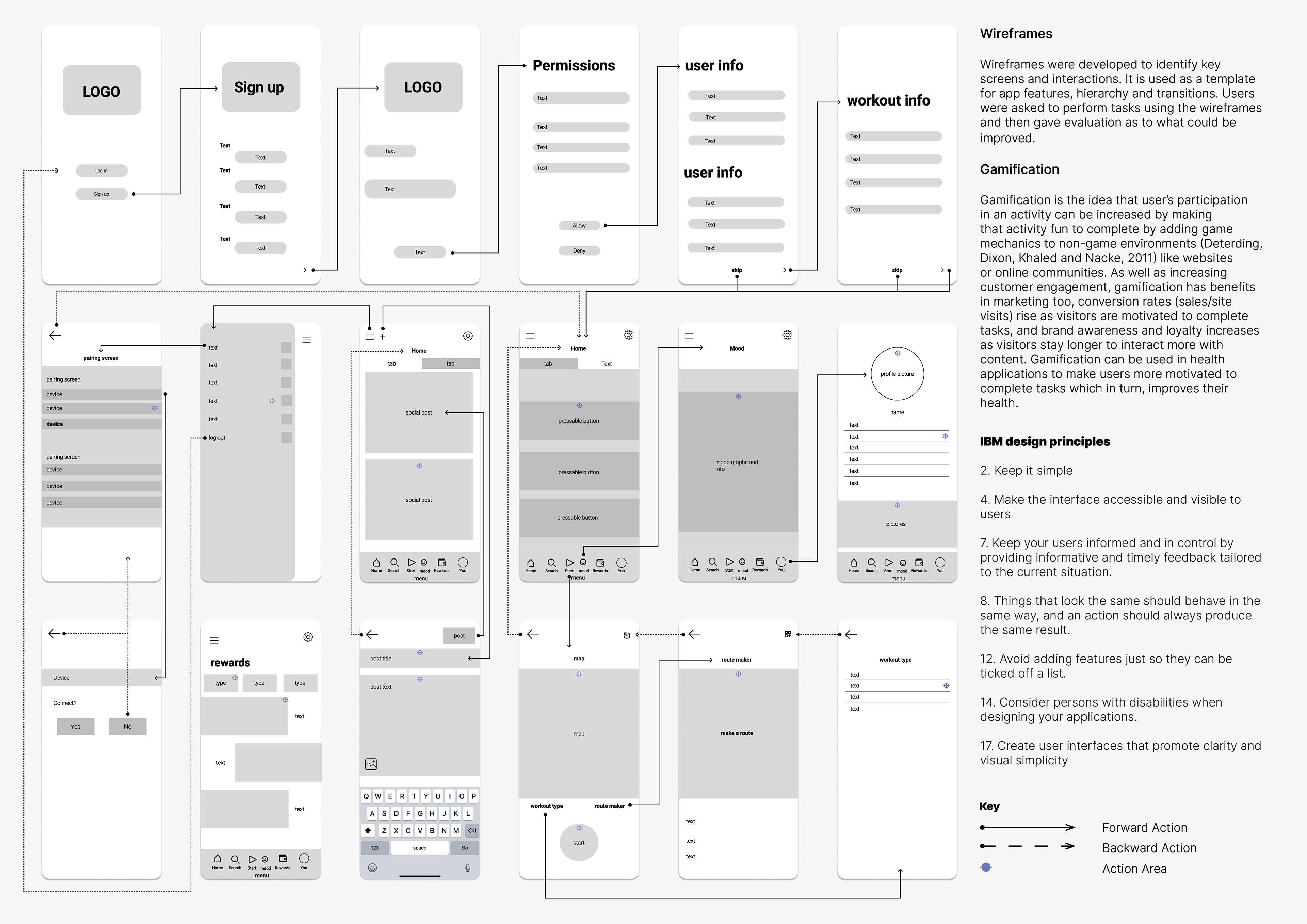
A low fidelity wireframe was presented to potential users and they were given tasks to complete. This outcome was achieved after adjustments were made based on task completion rate. Several processed were simplified to reduce cognitive load, and to ensure that the app was easy to navigate for new users.
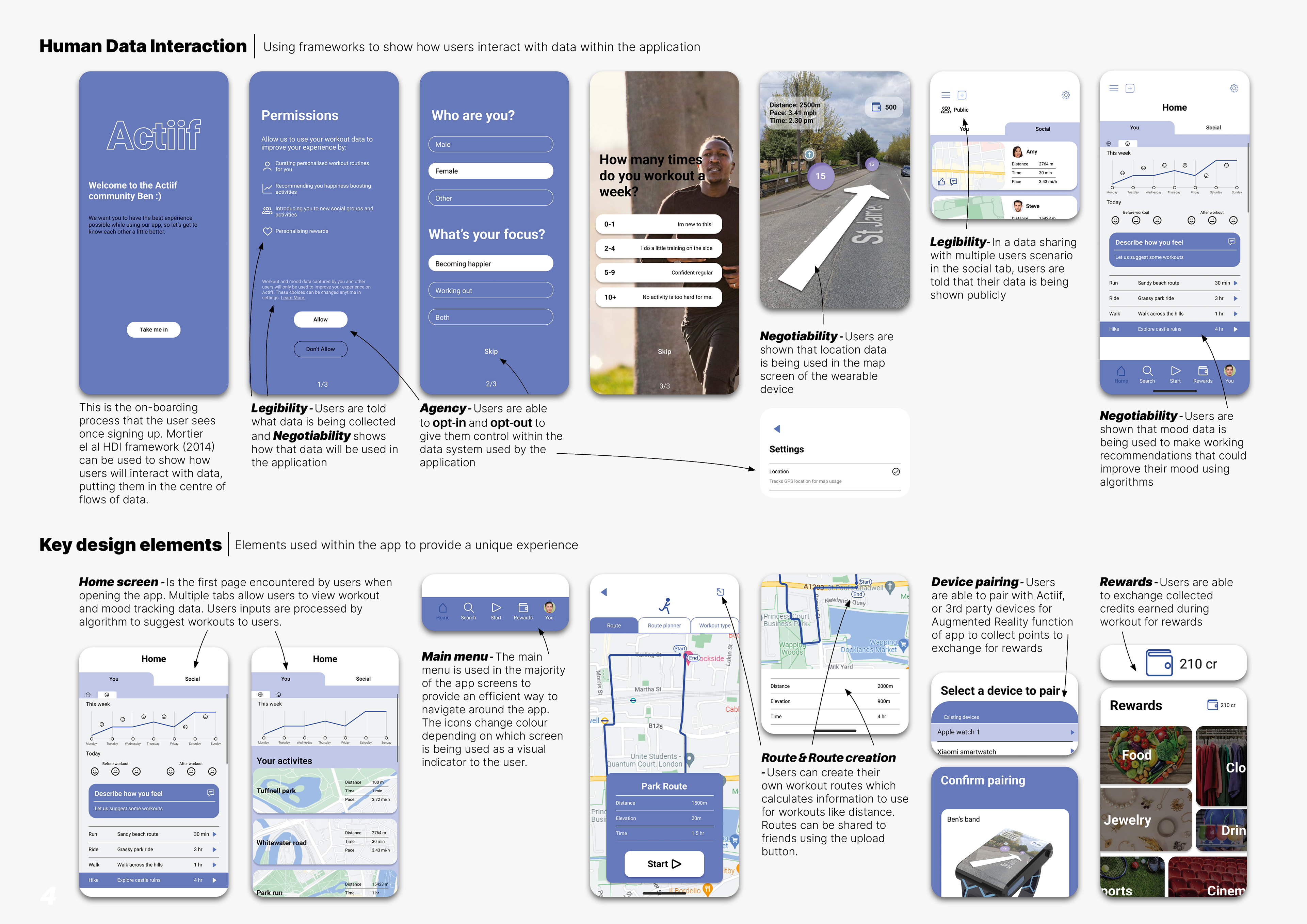
Human data interaction highlights where users would interact and input their data. It was important to show users where and how their data would be used. An example of this can be seen in the exercise suggestion feed, where user's happiness data is used to suggest what they should do next.
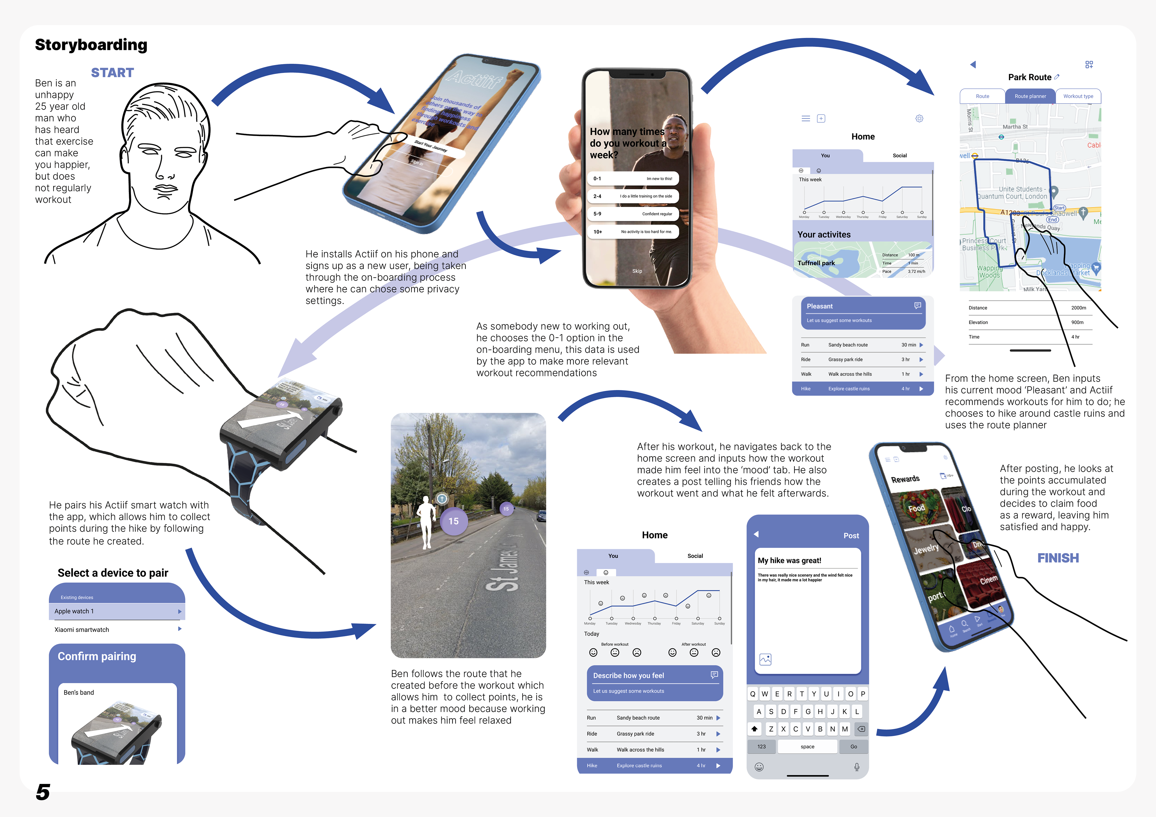
This user flow storyboard was used to ensure that the service would be coherent and usable by new users. The potential user 'Ben' carries out the tasks from beginning to end through these steps, which demonstrates how he may become happier after use.